Keep up with Bitcoin
In less than 15 minutes per week
FEATURE OVERVIEW:
EDITORIAL SECTION
TLDR
“Too Long, Didn’t Read” If you simply can’t be bothered to keep up with the news, this is the bare minimum you should read to get a feeling of what’s happening.
My Thoughts
An extended opinion for the week, usually related to understanding Bitcoin in the landscape that surrounds it, sometimes addressing one or more hot topics of the week in more detail.
NEWS + COMMENTARY
BITCOIN NEWS
Documents the week’s most relevant and positive developments in Bitcoin and its adoption.
“CRYPTO” NEWS
Usually commenting on clashes between Bitcoin, Crypto and Fiat. Occasional guest appearances by egregious or funny crypto-scams. NOT meant as comprehensive coverage of “crypto”.
FIAT NEWS
News reflective of the (usually deteriorating) state of Fiat, its rulers. mechanisms and minions.
DEEP DIVE (Ocassional)

A link to a piece of high quality long-form content, could be a video, podcast or article. Usually requiring a time investment of 60 minutes or more.
These can be recent or classic pieces of content may or not be news-related.
THE THREE PRICE CHARTS
I always publish these same three charts —I believe the consistent format helps you develop long-term perspective of the price-action (every now and then I also include interesting charts from other people).
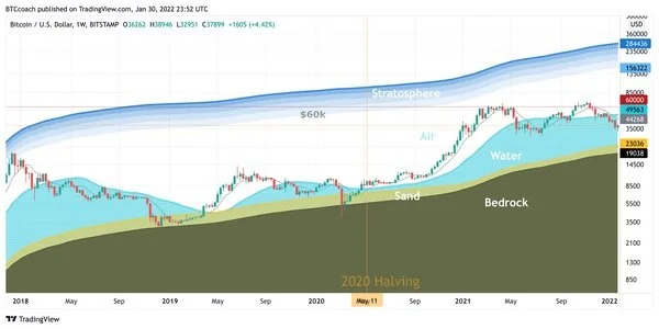
BTC Surfing
This Weekly Chart is my favorite way to understand where price action seem to be in terms of the cycle.
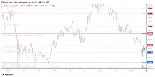
Dip Fishing
The Daily Chart (each candle represents one day) is useful for a “higher resolution” view of what price did in the week.
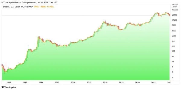
Calm Chart
The Monthly Chart (each candle represents a full month) helps you zoom out from the short-term ups and downs of price-action.
More about the Three Charts
Here’s some info on how to interpret the three charts in every issue:
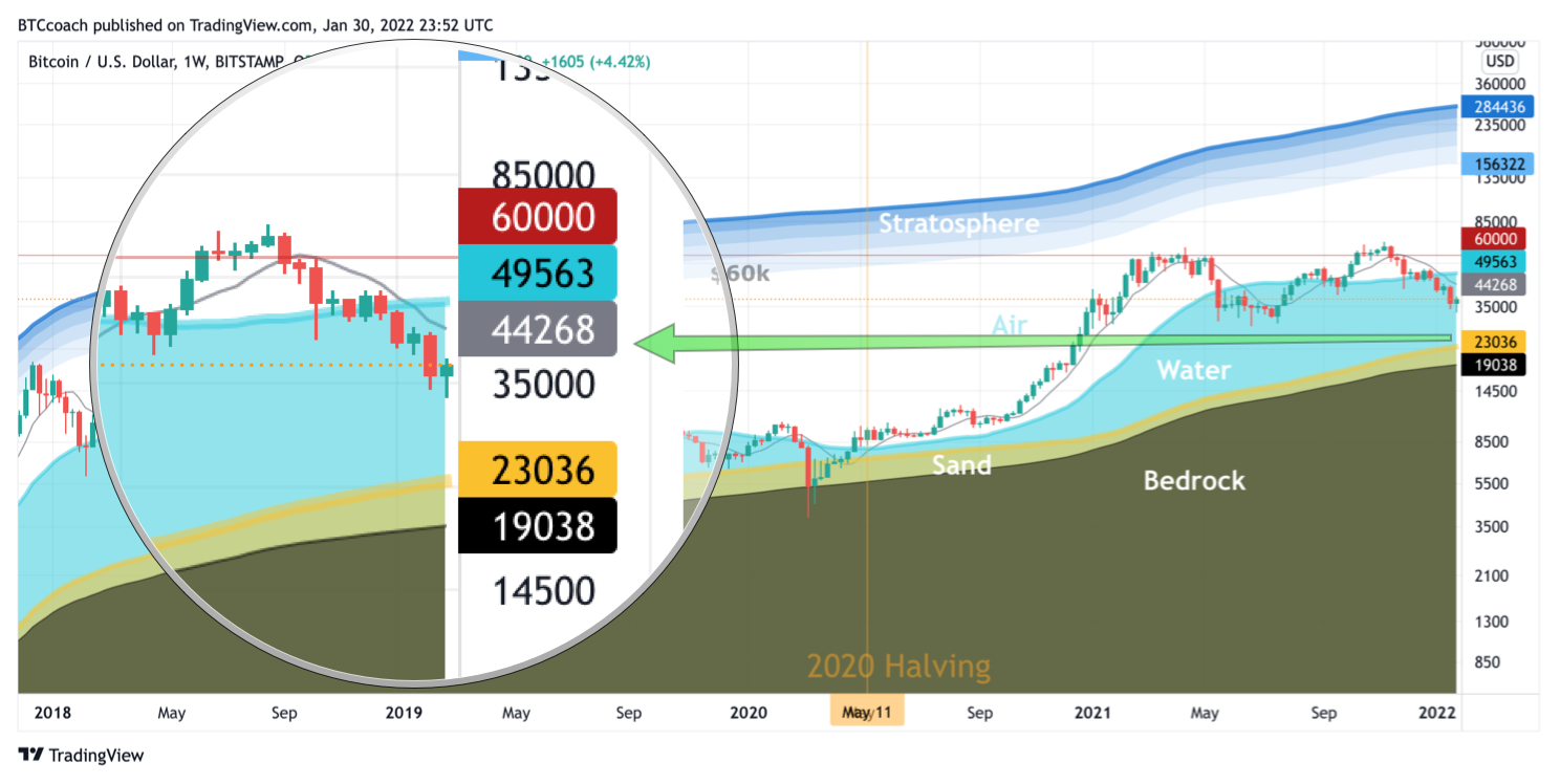
Bitcoin Surfing - Weekly Candles
This Weekly Chart (where each candle represents one week) is my favorite way to understand where price action seem to be in terms of the cycle. It uses mostly moving averages to draw shaded areas. Very little in this chart is manually added by me beyond the labels, usually only the “top resistance”.
Because it covers a long time, I usually use the “zoom/loupe” call-out circle to highlight the most recent candles.
I use the metaphor of the price of Bitcoin as a kite-surfer in the hopes it helps non-technical people understand hoe certain key levels can influence price behavior.
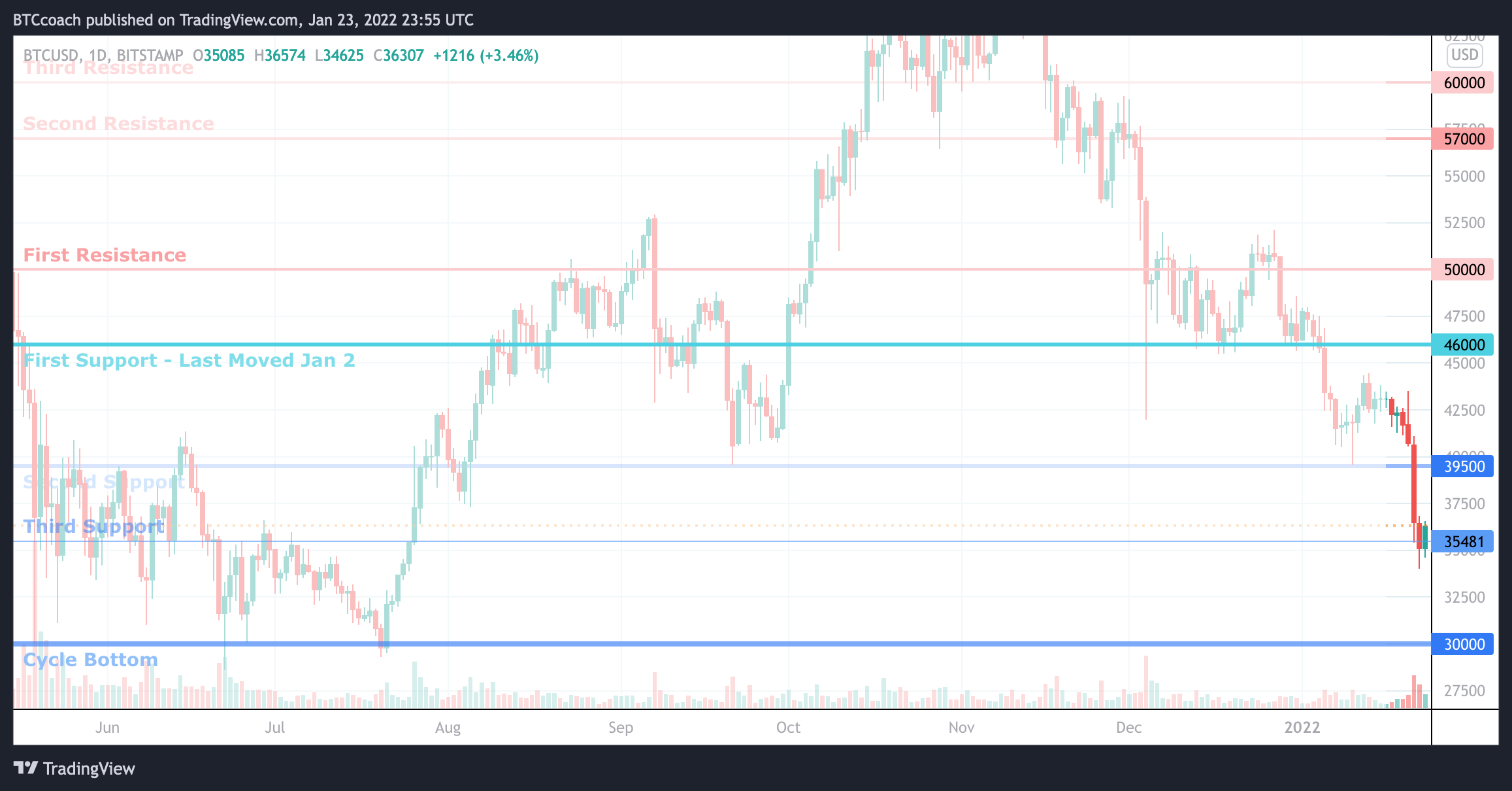
Dip Fishing - Daily Candles
The Daily Chart (each candle represents one day) is useful for a “higher resolution” look at what price did in the week.
I usually mark what I see as key supports and resistances —prices where Bitcoin’s price might “bounce”— and this can be useful for buying dips.
I try to mark price levels that I feel comfortable not changing for months on end. Supports can turn into resistances and viceversa, but the line stays in place.
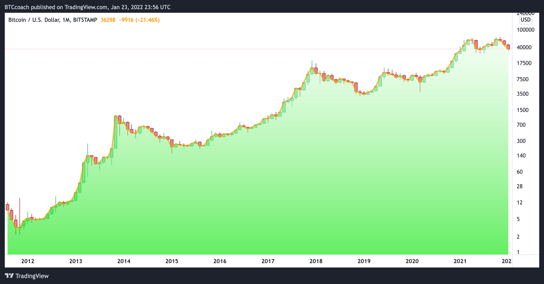
The Calm Chart - Monthly Candles
The Monthly Chart (each candle represents a full month) helps you zoom all the way out. Hopefully providing some relief from the ups and downs of the shorter-term charts.
It’s important to understand that this chart is drawn in log scale, which means the distance between each “click” in the numbers on the right represents a doubling in value —the visual distance between $100 and $200 is the same distance as that between $40,000 and $80,000